01 · Primary wordmark
The name
A direct, confident wordmark. Tall lettering and a simple dividing line give the artist’s name a clear presence.
 Open to the right creative role
Manning Rothrock · Artist identity · TeamPhun
After more than a year without a resolved direction at TeamPhun, I picked up Manning Rothrock’s branding project and brought it into focus in two weeks. The result: a distinctive identity that matched the brand he had envisioned.
Explore the identity
Without a resolved brand direction
To align the identity with his vision
Logo family, color, typography, and brand guidelines
01 · Getting it right
Manning had a vision for his brand. The challenge was translating it into a visual identity he could recognize as his own.
I took ownership of the project and focused on that connection. The finished system pairs a straightforward name treatment with an iconic MR monogram, then gives the brand a more expressive side for merchandise.
For me, the win was getting a long-stalled project moving and delivering something that finally matched what the client had in mind.
02 · The identity
A focused logo family gives the brand flexibility, from the full name to a compact monogram and a more expressive merchandise mark.
01 · Primary wordmark
A direct, confident wordmark. Tall lettering and a simple dividing line give the artist’s name a clear presence.
02 · MR monogram
A compact mark built from his initials. Recognizable at a glance, with a shape that holds its own on release artwork and smaller placements.
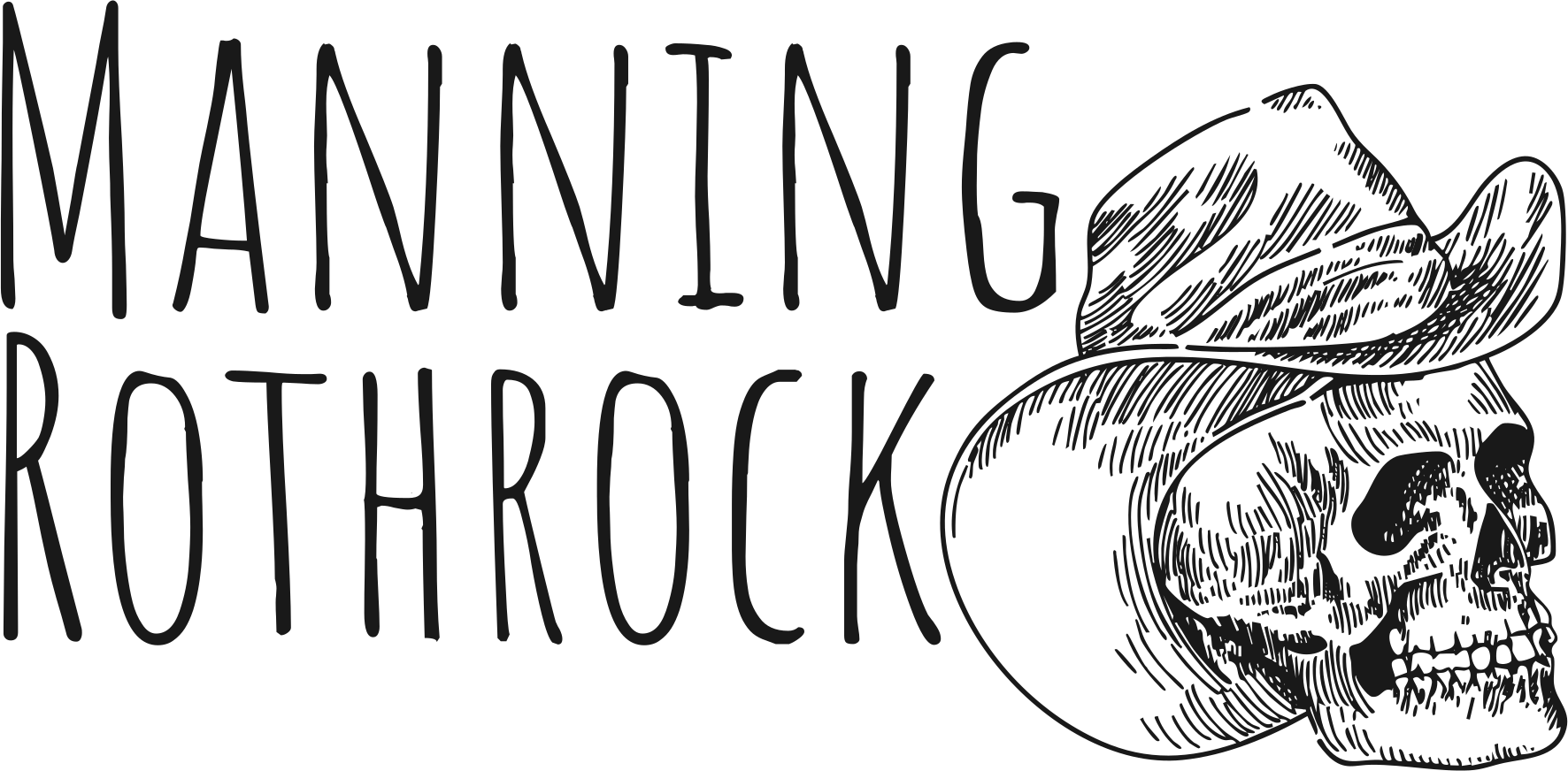
03 · Merchandise alternate
A little more edge: a cowboy-skull illustration and a looser wordmark for merchandise that can turn up the personality.
03 · A system to build on
Deep green, brown, warm sand, navy, and white ground the identity. Bebas Neue Pro and its Expanded Bold cut keep the typography direct and consistent. The guide brings the logo family, color specifications, and type choices into one practical reference.
04 · Out in the world
The MR monogram appears on Manning’s “Like I’ve Never Been In Love” release artwork and in his Spotify artist pick. Seeing the mark alongside the music brings the identity full circle.
Spotify screenshots from the project archive.
Listen to Manning RothrockCreative direction · Client alignment · Brand identity