Elevate trust
Give enterprise clients a polished, consistent experience at every touchpoint.
 Open to the right creative role
Brand transformation
Creative operations
Director of Creative & Design
I modernized a 20-year-old identity for a new era of corporate clients—then helped redesign the system that moved creative work from first request to fulfillment.
The opportunity
A new CEO and leadership team needed TeamPhun to feel credible to large, publicly traded clients without sanding away the character that made the company memorable. At the same time, growing creative demand exposed a fragmented workflow across Salesforce, email, Google Chat, text messages, shared drives, and manual status checks.
Director of Creative & Design
One month
Identity, templates, website, social, systems
Leadership, sales, marketing, design, operations
01 · The rebrand
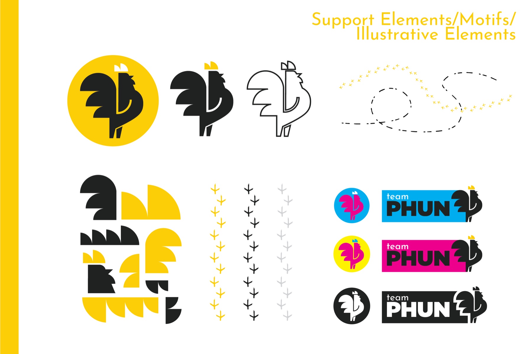
The rooster became more than a mark. Its shapes, tracks, color, and attitude created a flexible system that could live across digital experiences, apparel, sales tools, client proofs, and physical production.
Give enterprise clients a polished, consistent experience at every touchpoint.
Preserve the energy, color, and recognizable personality leadership valued.
Build a system that works on screens, garments, proofs, print, signage, and swag.
Before → after
The transformation is easiest to understand side by side: a legacy mark rooted in the company's past, and a simplified identity designed to perform everywhere next.
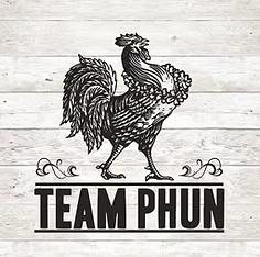
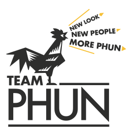
A detailed legacy rooster with a rustic, promotional-products feel.

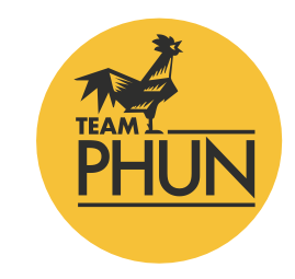
A simplified, scalable identity built for enterprise clients and real production.
Why this direction
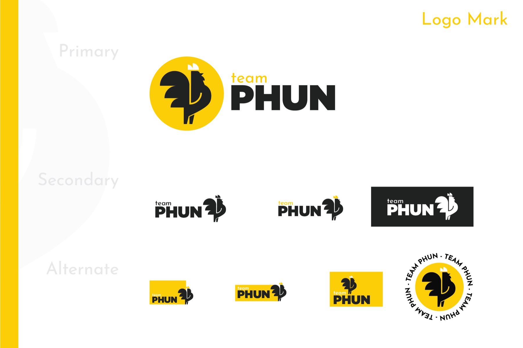
The owners wanted an identity that could speak more confidently to a corporate audience without losing the personality behind TeamPhun. Keeping the rooster mattered—it carried a meaningful personal story for one of the owners—so I simplified it into a stronger, more scalable form. The result created a polished core identity with enough flexibility to become more playful whenever the moment called for a little more Phun.
The almosts
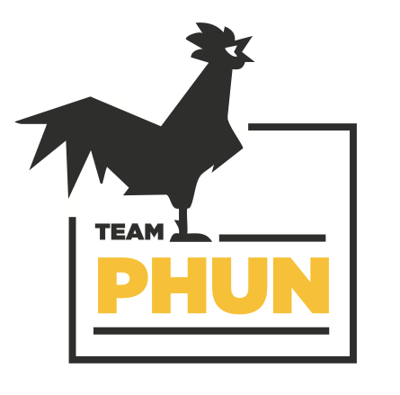
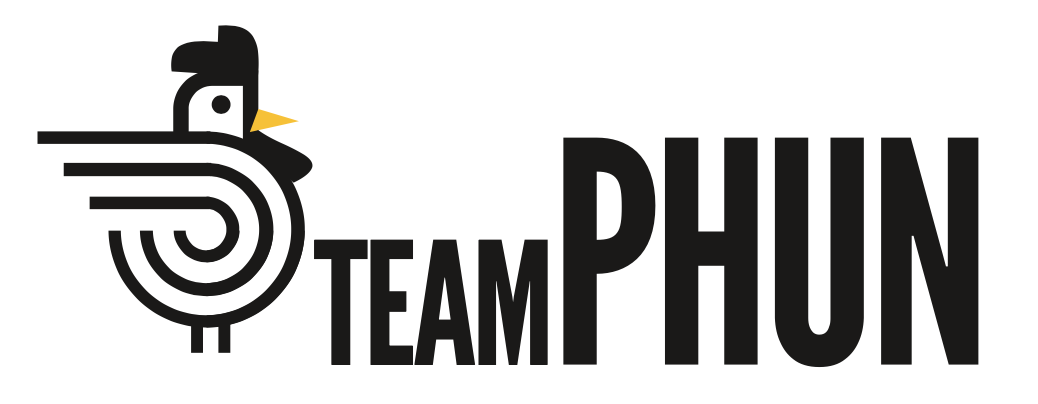
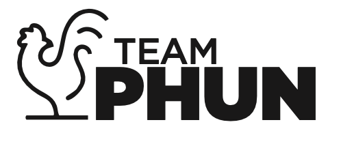
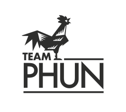
A logo rarely arrives fully formed. These directions tested how far the rooster could stretch—from legacy and literal to geometric, minimal, and playful—before the right system came into focus.
Inside the system
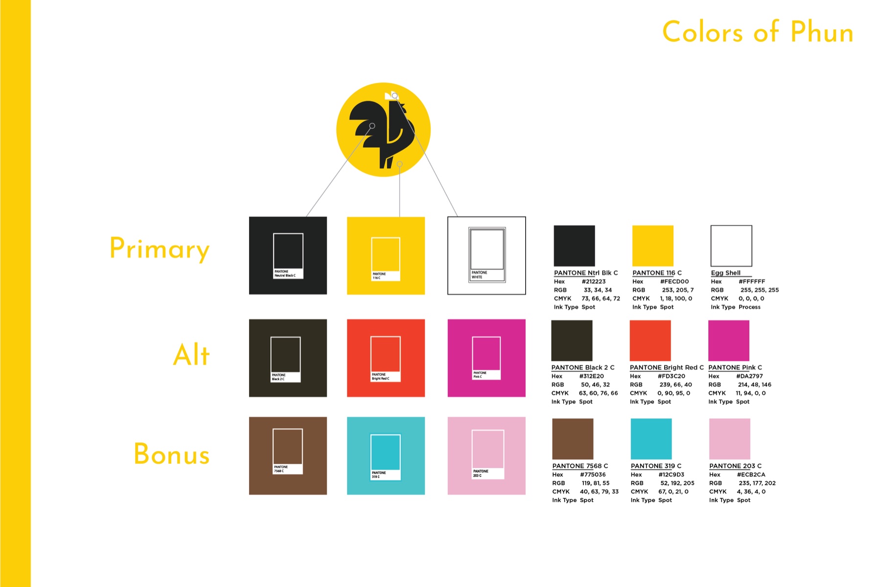
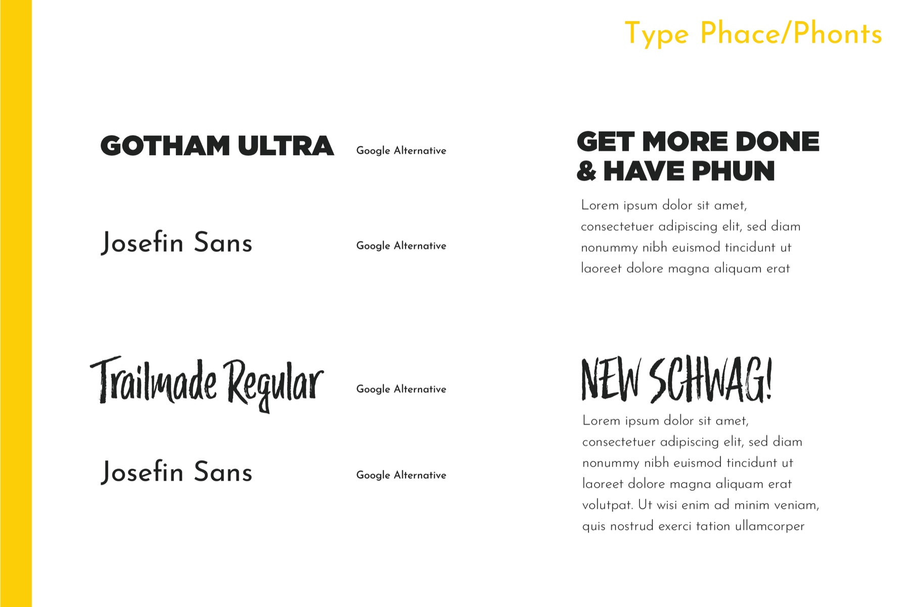
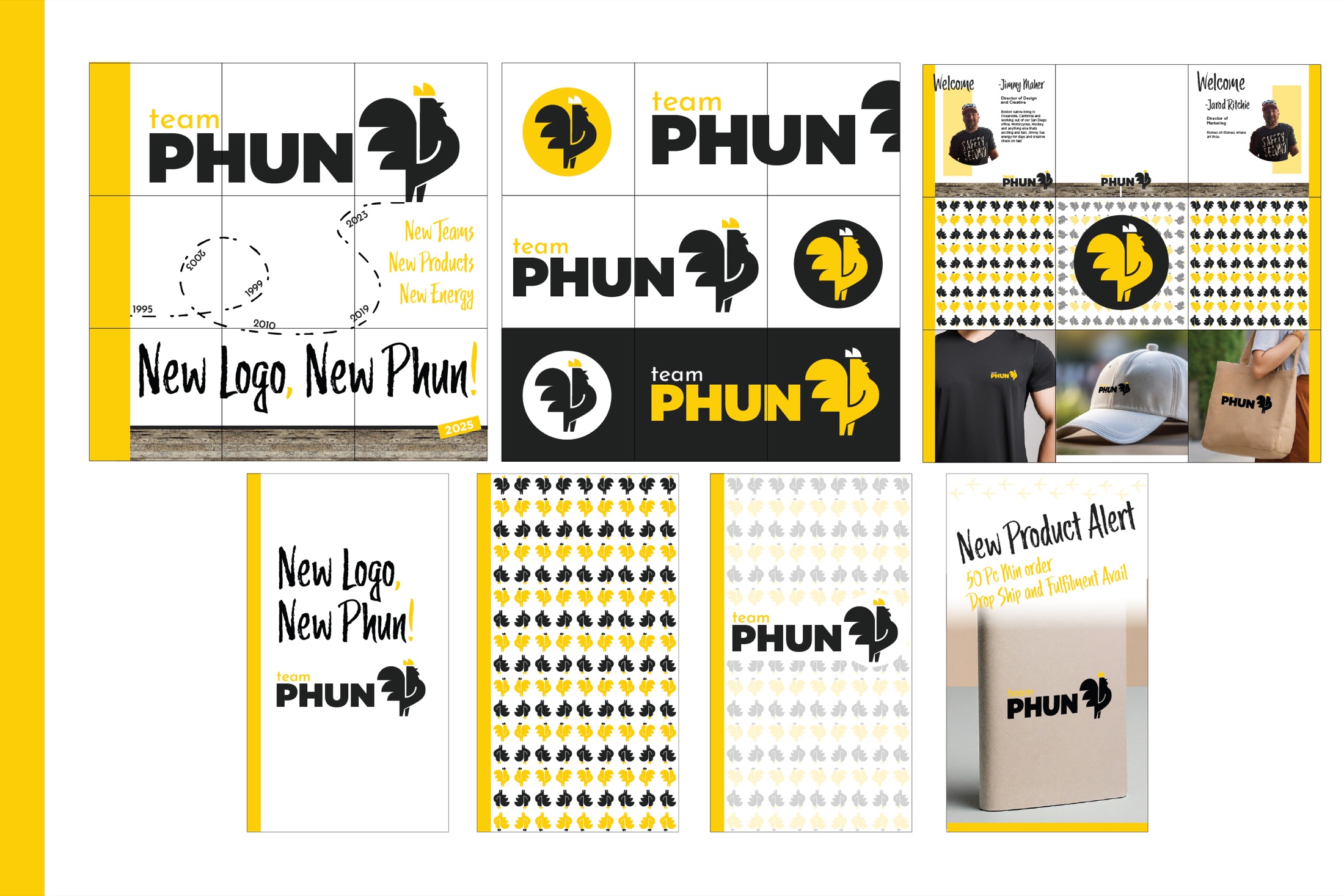
The guide turned a new mark into a usable identity. It defined how the logo, colors, type, voice, tracks, and modular shapes could work together—then gave the team enough structure to stay consistent without becoming predictable.
The system in use
This wasn't one logo stamped everywhere. The rooster, track motif, typography, voice, color, and placement rules became a flexible kit that could create distinct ideas while still feeling unmistakably TeamPhun.
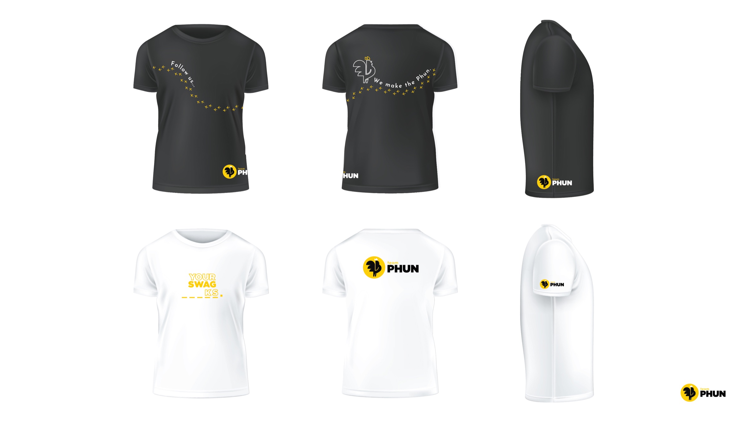
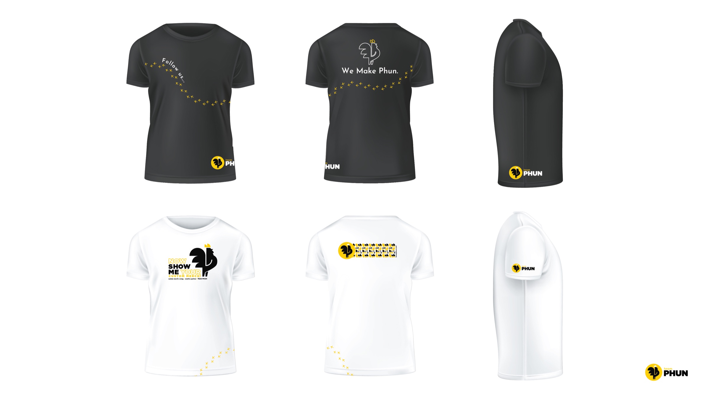
Core identity, rooster tracks, campaign language, and playful variations—all built from the same recognizable toolkit.
Select either image to view full size ↗From geometry to production
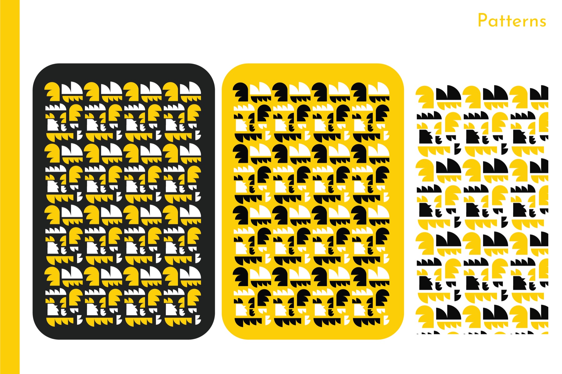
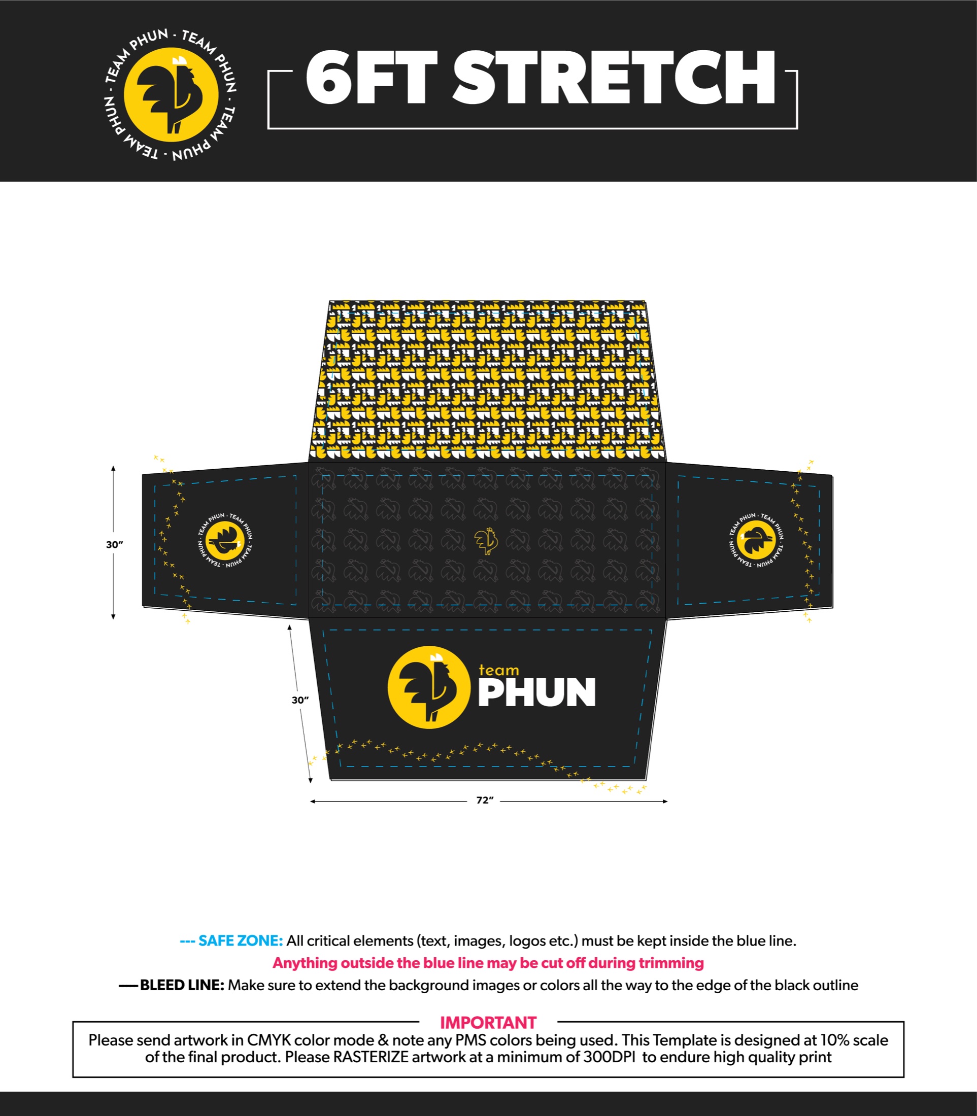
The repeating pattern breaks the rooster into its core geometric parts and reorganizes them into a modular field. The table throw combines those pieces with the complete mark and track motif—then documents every safe zone, bleed, dimension, and production requirement needed to manufacture it correctly.
02 · The operational challenge
Designers monitored Salesforce Stage 03 for requests, sent mockups to sales through chat, and waited for edits to return through email, chat, or text. Operations manually watched later stages without dependable notifications.
I helped translate the real sales-to-creative-to-operations journey into a connected system with structured intake, visible ownership, automated status changes, centralized feedback, and dependable handoffs.
03 · The creative operating system
Website + HubSpot + Zapier + ClickUp + Google Drive
A website form captured the customer, project, product, and job information at the source.
HubSpot and Zapier carried the request into a dedicated ClickUp creative queue.
Client email feedback appeared as task comments, keeping edits and decisions with the work.
Approval changed the project status, notified design, and triggered production-ready asset creation.
Completed files and project details moved into the operations workspace for fulfillment and tracking.
04 · What changed
Client edits reached design directly instead of waiting in a salesperson’s inbox.
Every comment, approval, status, and next action lived with the project.
Generated work orders carried the right client, job, product, and production information.
The team could follow mockups through completed projects and surface opportunities needing attention.
Designed for accuracy
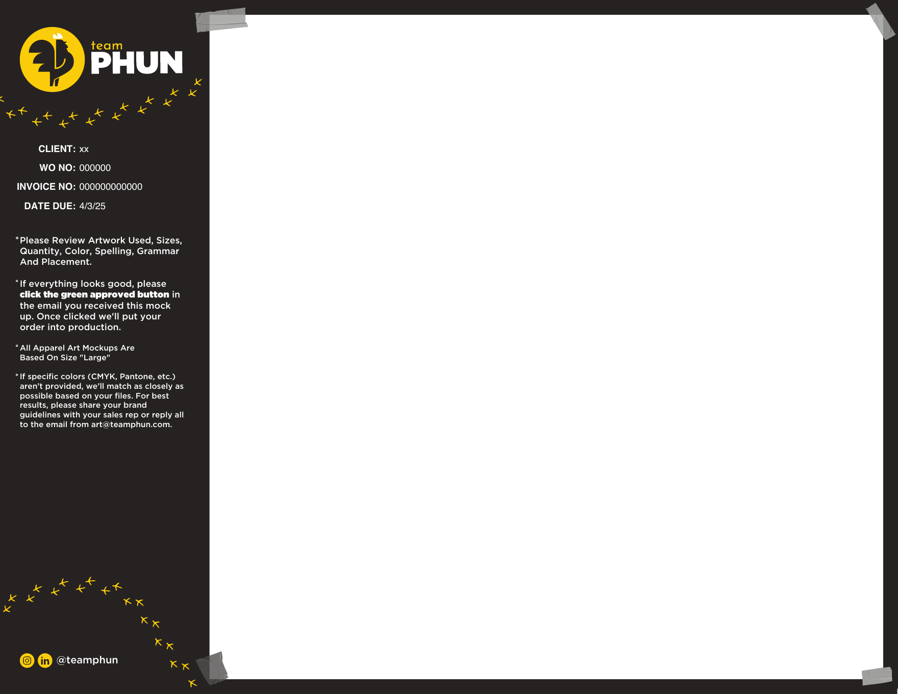
The proof template carried essential customer, job, invoice, product, and approval information into the creative itself. That gave every designer a reliable source of truth and reduced ambiguity before production.
Production standards
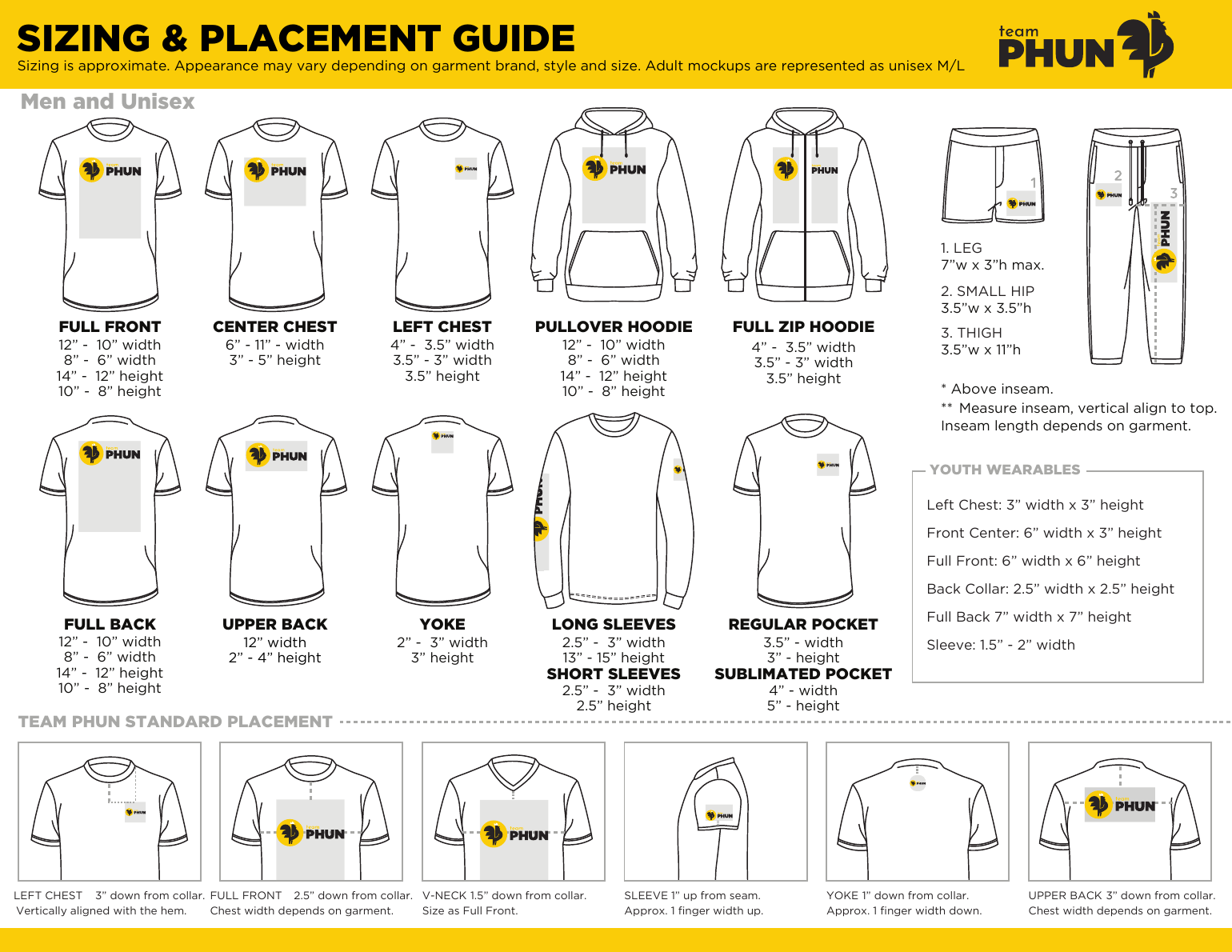
I created a standard apparel sizing and placement guide so every logo landed consistently—whether files were prepared by TeamPhun, a production partner, or a client's in-house creative team. It gave everyone shared specifications for location, width, height, and garment type before artwork entered production.
My contribution
I led the brand transformation, built the Manus website and customer intake forms, connected submissions into the ClickUp workflow, and collaborated with a contract marketing specialist on the broader HubSpot implementation. The work required creative direction, hands-on design, systems thinking, and coordination across sales, marketing, design, and operations.
Client work · PetVet Care Centers
My role stretched from creative direction to the details that made an idea real: presenting the concept, designing the experience, preparing production files, working with vendors, and finding the next opportunity for the client.
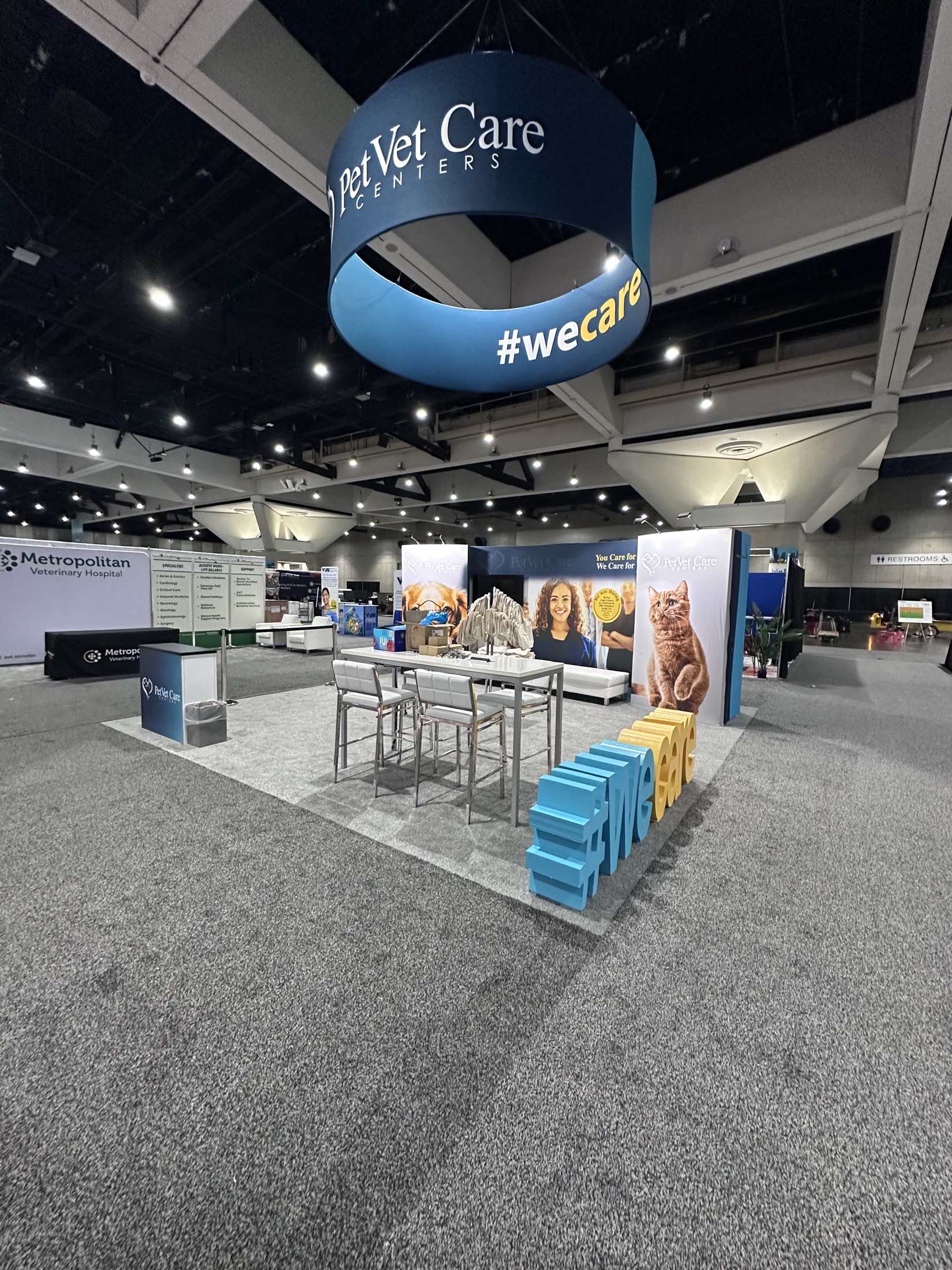
PetVet Care Centers
The booth carried the brand from a large suspended sign to counters, environmental graphics, hospitality space, and custom 18-inch-tall #wecare letters. The dimensional message became a bold, photo-friendly moment at the edge of the experience.
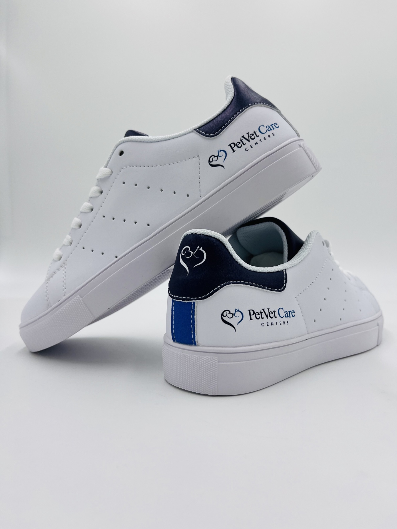
While presenting the booth artwork, I pitched custom shoes for the event team as a low-pressure extra. I created the mockups, explained that we could start with a five-pair minimum, and worked with local supplier Sock 101 through several iterations. The team loved them—and the idea became an additional order.
TeamPhun · Brand + Creative Operations